Click the image. The menu appears at the click coordinates, not the element's top-left corner.
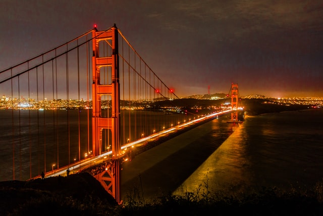
.alap_cityphotos sets margin-top: 0 so it sits flush.
Every Alap menu can be styled globally or per-anchor. This example shows how.
The base .alapelem styles apply to all menus:
browse cars.
The BMW item has cssClass: "highlight-blue" and the Miata has "highlight-red".
.alapelem {
  background: #ffffff;
  border: 1px solid #e5e7eb;
  border-radius: 6px;
  box-shadow: 0 4px 12px rgba(0,0,0,0.1);
  margin-top: 0.5rem;   /* vertical offset */
  margin-left: 0;       /* horizontal offset */
}
This
bridges
menu has margin-top: 1.5rem for a bigger gap below the trigger.
.alap_bridges {
  margin-top: 1.5rem;   /* push menu further down */
}
This
coffee spots
menu has margin-left: 2rem to shift it right.
.alap_coffee {
  margin-left: 2rem;    /* shift menu to the right */
}
Each anchor's menu gets a class of alap_{id}.
Click
NYC spots
to see a dark-themed menu.
.alap_nyc {
  background: #1e293b;
  border-color: #334155;
}
.alap_nyc a { color: #e2e8f0; }
.alap_nyc a:hover { background: #334155; color: #60a5fa; }
A compact menu with narrower padding and smaller text.
.alap_compact {
  min-width: 140px;
  border-radius: 4px;
}
.alap_compact a {
  padding: 0.3rem 0.75rem;
  font-size: 0.8rem;
}
Individual items can have a cssClass in the config.
Click cars
— the BMW has a blue left border, the Miata has red.
// In config:
bmwe36: {
  label: 'BMW E36',
  cssClass: 'highlight-blue',  // applied to the <li>
  ...
}

// In CSS:
.highlight-blue { border-left: 3px solid #3b82f6; }
.highlight-red  { border-left: 3px solid #ef4444; }
Click the image. The menu appears at the click coordinates, not the element's top-left corner.
.alap_cityphotos sets margin-top: 0 so it sits flush.
.alap_cityphotos {
  margin-top: 0;   /* no offset for image-triggered menus */
  margin-left: 0;
}
/* 1. Base styles for all menus */
.alapelem { ... }

/* 2. Per-anchor overrides (menu gets alap_{anchorId}) */
.alap_bridges { ... }
.alap_nyc { ... }

/* 3. Per-item overrides (li gets cssClass from config) */
.highlight-blue { ... }